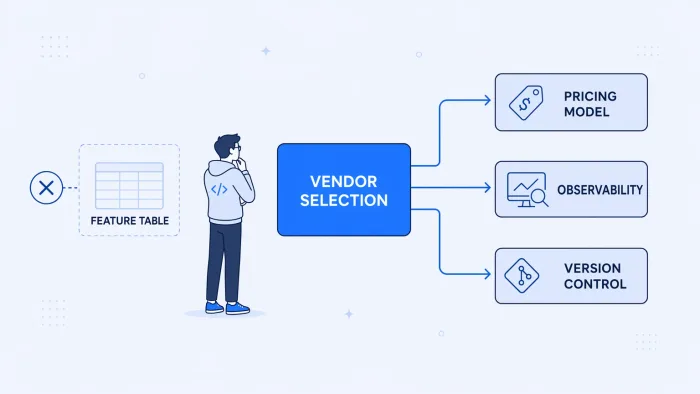
You run the evaluation. Connector counts look comparable. Uptime SLAs are all 99.9%. Every platform has AI in the deck. The pricing calculator is reassuringly low at your current workflow count. You pick the one with the slickest demo and the connector list that covers your stack.
Eighteen months later, a workflow that runs more than expected doubles your bill. The integration that broke on Thursday is still unresolved because the trace retention is seven days and this is day nine. The engineer who built the original flows left, and nobody can find what changed three months ago.
The evaluation didn't fail. It measured the right things for the wrong problem — how well a platform demos, not how well it survives production. Most iPaaS solutions comparisons are built around criteria vendors have optimized their sales motions to answer. The criteria that predict whether you'll still be on the platform in two years are almost never in those comparisons.
This post covers the evaluation layer most guides skip: the structural properties of an integration platform that determine production fit. Not connector counts. Not whether there's an AI checkbox. The dimensions that decide whether integration becomes infrastructure you trust or a recurring incident you manage.
iPaaS Evaluation Checklist: What Actually Predicts Fit
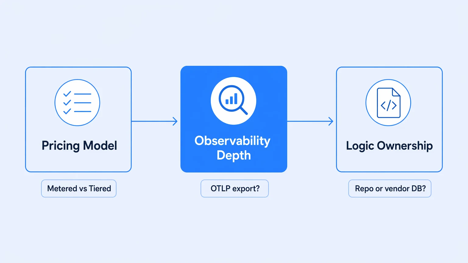
Skip the connector count and the demo. These three structural questions predict whether a platform holds up in production — ask them before signing anything.
| Dimension | Ask this | Red flag |
|---|---|---|
| Pricing model | Does my bill scale with the business value I get, or with upstream retries and backfills I don't control? | Usage-metered pricing with no cap on partner-triggered retries. |
| Observability depth | Can I export distributed traces to my own stack (Datadog, Honeycomb, Grafana), or only view a run-history list in the vendor's UI? | "Monitoring" means a green/red execution list, not OpenTelemetry-compatible traces. |
| Who owns the logic | Is a workflow a file in my own repo I can diff, branch, and review — or state trapped in the vendor's database? | "Version history" with no real diff or review workflow. |
The evaluation criteria most guides optimize for are the wrong ones
Walk through a standard iPaaS evaluation rubric — the analyst-influenced kind, the kind packaged as a 50-row spreadsheet — and you'll find a predictable cluster: connector count, supported authentication schemes, uptime SLA, SOC 2 certification, "AI-powered automation," list price at your current workflow count.
Every serious vendor passes all of these. Not because all platforms are equivalent, but because these criteria were designed to screen out clearly bad options, not to surface meaningful differences between mature ones. By the time you've shortlisted three vendors, all three have passed the same filter. The spreadsheet converges.
Feature-matrix evaluations reward what's easy to demo and cheap to claim — and systematically miss what determines whether a platform holds up in production.
The connector count is the obvious example. A platform with 1,200 connectors sounds better than one with 400. But if 900 of those connectors are shallow — they can read but not handle a paginated write, can't retry on rate limits, can't surface a useful error on a downstream 422 — the number is noise. The question is how deep the connectors you actually need go. That's a demo question, not a spreadsheet question.
The same inversion applies to "AI features." Every platform added something with the word AI in it over the last 18 months. Evaluating AI-readiness by checkbox presence evaluates a criteria that's already been gamed. The real question is whether the substrate underneath is solid enough to run AI-generated actions on — which circles back to observability, versioning, and cost predictability.
The case for integration observability puts it plainly: what separates platforms worth owning from platforms worth renting is three properties — who holds the logic, who holds the telemetry, and who controls the bill. Feature matrices don't measure any of them.
Pricing model predicts production behavior more than list price does
The number in the pricing calculator at evaluation time is not the relevant number. The relevant question is: how does cost behave when the platform is actually working?
Integration traffic is not linear. Workflows that start small get promoted. Partners retry. A backfill job fans out. A loop hits a pathological case. None of this is unusual — it's what happens when integration becomes load-bearing in production. The pricing model determines whether that normal growth stays predictable or turns into a finance conversation.
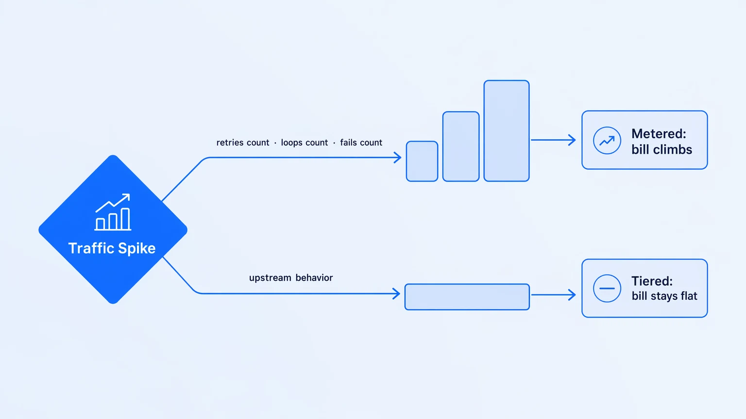
Usage-metered pricing — per execution, per task, per operation, per credit — couples your bill to upstream behavior you don't control. On most metered platforms, retries count. Loop iterations count. Failed runs bill for the steps that completed before they failed. The unit your vendor charges for has almost nothing to do with business value delivered and a lot to do with how noisy your upstream partners are on any given week.
| Billing model | What happens when traffic spikes | Who controls the bill |
|---|---|---|
| Per execution / task | Bill climbs with workflow volume | Upstream partner behavior |
| Per connector / flow | Scales with breadth of integrations | Your integration architecture |
| Feature-tiered (no overages) | Bill stays flat within the tier | You — it's a planning input |
The difference is structural. A platform priced per execution makes your bill a function of your partners' reliability. A platform priced on features and tiers makes your bill a planning input. When Workato switched to consumption-based pricing in mid-2024, teams that had been on flat contracts found that retries, loops, and dev/test runs suddenly all counted. The invoice doubled for workflows that hadn't changed.
The pricing model you sign is the incentive structure you live with — and metered pricing quietly discourages putting more of the business on the platform, because every new dependency adds another line that scales with traffic.
When evaluating any iPaaS, ask the billing question before you ask the feature question: what happens to cost if this workflow runs ten times as often next quarter? If the answer requires a calculator, the model is metered. If the answer is "the same," the model is tiered. The model type tells you more about the vendor's incentives than the feature list does.
Observability depth determines how fast you recover — not whether you recover
Every platform has "monitoring." Almost none of them mean what engineers mean by it.
What most iPaaS solutions offer is a run history viewer: a list of workflow executions, green and red, with a payload inspector on the individual-step level if you're lucky. It tells you that something ran, and whether it succeeded. It does not tell you why a specific step took nine seconds, what the malformed field in the response was, or how this workflow's behavior correlated with a downstream service degradation that started three minutes earlier.
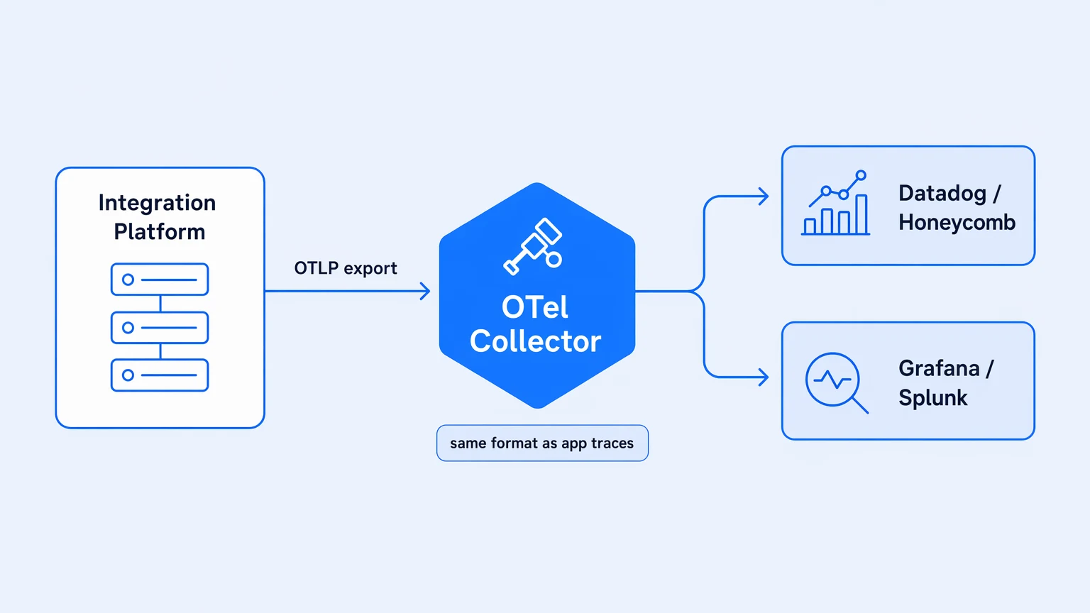
For that you need traces — not a log viewer, not a metrics dashboard, but distributed traces with timing and attributes that you can correlate with the rest of your system. And the tell is not whether a vendor claims to have "observability." The tell is where the telemetry can go.
Ask: can I export traces to my own observability stack — Datadog, Honeycomb, Grafana, whatever we already run — on every pricing tier, in a standard format?
The honest answer from most platforms is: no, or "yes, on Enterprise," or "you can wire up your own log exporter." Observability is routinely gated to premium tiers, which means your integration layer — typically the most failure-prone surface in your architecture, because it's the seam where other people's systems meet yours — is the one surface you can't see into from the tools your on-call already knows.
OpenTelemetry changes this specifically because OTLP is the standard. Platforms that emit spans in OTLP format land in whatever you already run. The integration failure becomes an incident you debug in your normal tooling, not a separate investigation in a separate console with a different retention window. When the retention window in your observability stack is 30 days and the vendor's run history is 7 days, native OTel export is the difference between being able to answer the question and not.
The platform that can't show you a trace from two weeks ago is the platform that forces you to reconstruct incidents from memory.
Not every platform offers this. Among mature iPaaS solutions, native OpenTelemetry export on the free tier or lower tiers is not standard — it's gated, after-market, or absent. That gap is worth the evaluation time to confirm, because the answer shapes your incident-response capability for as long as you run the platform.
Who owns the logic determines your exit risk and your review discipline
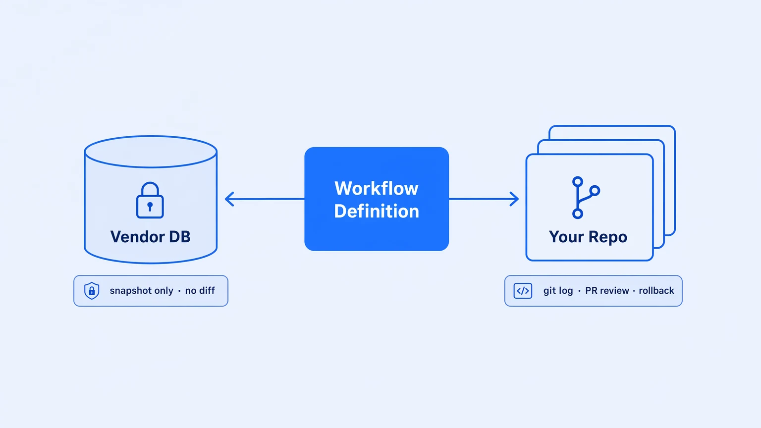
The third structural dimension is the one vendors are most motivated to obscure, because it directly affects lock-in.
Where does the workflow logic actually live? This sounds like an architecture question, but it's a control question. If the logic lives in the vendor's database — as a JSON blob, a recipe graph, a Zap record — then version control is whatever the vendor chose to implement. Usually it's a snapshot system: the platform saves the current state on demand, assigns a version number, and lets you revert. You cannot read a diff. You cannot review a change before it ships. You cannot tell what changed between two versions without opening both and comparing them manually.
That's not version control. That's version history with no resolution.
Real version control means the workflow is a file in your repository — branched, diffed, reviewed, and merged through the same Git flow your application code goes through. The change history is git log. The review is a pull request. The deployment is a promotion through environments, not a click in a vendor UI.
The distinction matters on three axes. Review discipline: code that goes through review before shipping has materially different quality than code that doesn't — and that discipline only extends to integration logic if the platform enables it. Audit posture: when a compliance auditor asks what changed on integration X on March 14, "someone edited it" is not an answer; a commit hash is. Exit risk: if the logic lives in your repository, migrating is a software problem; if it lives in the vendor's database, migrating is a scraping-and-translating problem. Those are different problems by an order of magnitude.
Logic that lives in your repository is yours; logic that lives in someone else's database is theirs with your license on it.
Evaluate this by asking to see a workflow's actual diff — the diff between two versions — not the version list. Ask where the file lives on disk. Ask whether you can clone it with git clone. The answer tells you whether version control is a real property of the system or a UI feature that uses the word.
Evaluate for the steady state, not the demo
iPaaS evaluation guides optimize for the demo because demos are what evaluation processes surface. The criteria that actually determine production fit — how pricing behaves under load, where the telemetry lives, who holds the logic — are harder to demo and easier to gloss over.
Run your evaluation against those three dimensions and the field narrows significantly. Most platforms fail at least one. The ones that pass all three aren't necessarily identical, but they're the ones worth deeper analysis.
If you want to put these criteria to work, Koodisi's Community tier is free — no credit card required. Import an OpenAPI spec, build a real workflow, watch it emit OTel traces to your existing stack, and check what your bill looks like if you run it ten thousand times this month. The answer to that last question is the whole argument.